Table of Contents
01. Redesign or Small Fixes? 02. Warning Signs Your Store Needs Redesign 03. Review Mobile UX First 04. Check Product and Collection Pages 05. Look for Trust and Conversion Gaps 06. Protect SEO and Performance 07. Plan the Redesign Scope 08. Final Redesign ChecklistA Shopify store redesign should not be treated as a cosmetic refresh. For growing ecommerce brands, redesign becomes valuable when the current store no longer supports customer confidence, product discovery, mobile shopping or conversion. The question is not simply whether the store looks old. The better question is whether the current experience is holding back growth.
Some stores need only focused improvements. Others need a deeper redesign because the structure, page hierarchy, theme sections or buying journey have become difficult to improve. Understanding the difference helps ecommerce owners avoid unnecessary rebuilds while still recognising when the store needs more than small edits.
Redesign or Small Fixes?
Not every Shopify problem requires a full redesign. If the store has a strong structure but one or two weak sections, targeted CRO, copy or layout improvements may be enough. A redesign becomes more useful when problems appear across the full journey: homepage, navigation, product pages, collection pages, mobile experience, trust messaging and checkout confidence.
A redesign should create a better system, not just a better-looking homepage. It should improve how shoppers understand products, compare options, trust the brand and move towards purchase. If the current theme makes those improvements difficult, a structured Shopify store redesign may be the more practical route.
Warning Signs Your Store Needs Redesign
A Shopify store often gives clear signals when the experience is becoming outdated or difficult to scale. Some signals are visual, but many are structural. For example, the homepage may no longer explain the brand clearly, product pages may not answer key buying questions, or collection pages may make it hard for customers to find the right products.
Operational warning signs matter too. If your team avoids updating the store because sections are hard to manage, the design system is inconsistent or every change requires risky theme edits, the store may be limiting your ability to improve.
- The store looks visually inconsistent across key pages.
- Mobile visitors struggle to scan product information.
- Product pages do not clearly explain value, proof or delivery details.
- Collection pages feel like simple product grids without guidance.
- The homepage does not direct shoppers towards useful next steps.
- Your team cannot update core sections without developer support.
- Trust signals are weak, hidden or placed too late in the journey.
Quick Redesign Signal Check
Review Mobile UX First
Mobile UX is one of the strongest reasons to redesign a Shopify store. A store may look acceptable on desktop but fail where many ecommerce customers actually browse. Small screens expose unclear hierarchy, crowded sections, weak CTAs and product information that is too difficult to scan.
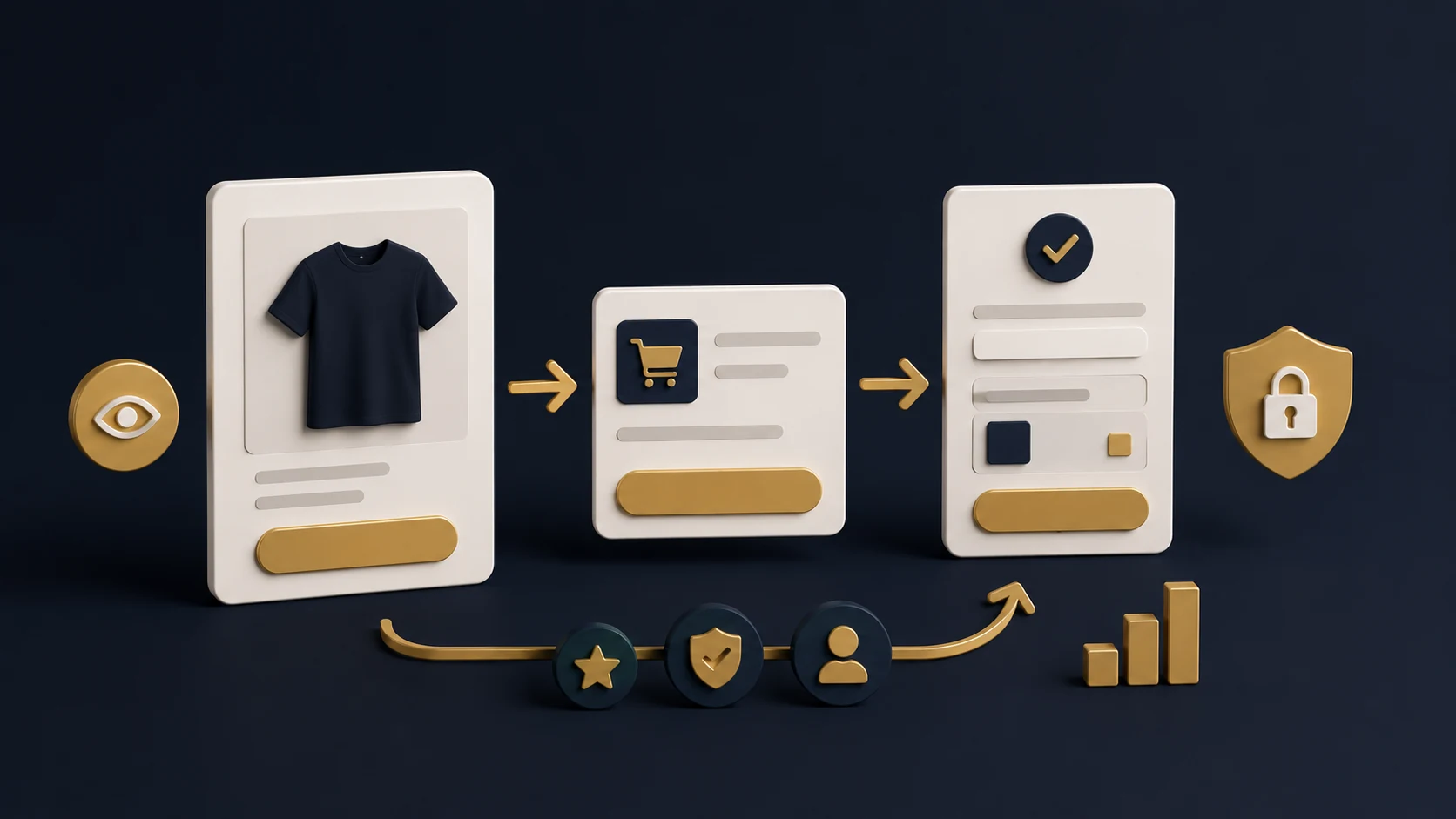
A mobile-first redesign should consider the order of information. Customers need to see the product, understand the value, choose options, check delivery details and feel confident enough to add to cart. If that journey requires too much scrolling, tapping or guessing, the store is creating friction.
- Check whether the main CTA is easy to find and tap.
- Review how product images, price and variants appear on mobile.
- Make delivery and returns information easier to access.
- Avoid overcrowded sections with too much text or too many cards.
- Test real product discovery and checkout paths on a phone.
Check Product and Collection Pages
Product and collection pages are often where redesign work has the most commercial impact. The product page needs to help customers make a decision. The collection page needs to help customers narrow choices without feeling lost.
A weak product page may have good images but poor hierarchy, unclear benefits, hidden delivery information or no strong trust signals near the buying action. A weak collection page may show products without enough context, filters or internal links to support discovery.
Product Page Redesign Checklist
Collection Page Redesign Checklist
Look for Trust and Conversion Gaps
A redesign should remove doubt. Customers often hesitate when they cannot understand the product, compare options, find policies, see proof or feel confident about delivery. These are not only content problems. They are design and structure problems too.
Conversion-focused redesign looks at where trust should appear in the journey. Reviews, guarantees, product education, FAQs, delivery information, returns, secure checkout messaging and brand story all need to be placed where they help the customer make a decision.
If your main issue is friction rather than visual identity, it may also be worth reviewing Shopify conversion optimisation alongside redesign planning. Design and CRO often work together when the buying journey needs to be clearer.
Protect SEO and Performance
A Shopify store redesign can improve search visibility and performance, but it can also create problems if SEO and technical checks are ignored. Changing templates, headings, internal links, collection content, URLs or page structure without planning can weaken important signals.
Before redesign work starts, identify which pages already matter for traffic, which collections need stronger content, which internal links should be preserved and whether any redirects are needed. Performance should also be reviewed because a visually richer design can become slower if images, scripts and sections are not controlled.
- Preserve important URLs where possible.
- Keep heading structure clear on key templates.
- Review internal links before and after redesign.
- Compress imagery and avoid unnecessary scripts.
- Check mobile performance before launch.
Plan the Redesign Scope
Once the warning signs are clear, the next step is to decide the redesign scope. Some stores need a full theme redesign. Others need priority templates such as homepage, product page, collection page and cart. The scope should be based on the parts of the store that most affect customer confidence and commercial performance.
RexCode’s Shopify store redesign service focuses on improving brand perception, trust, mobile experience and conversion flow for ecommerce stores that need a cleaner and more premium buying journey.
If you are unsure whether the store needs a full redesign or a smaller improvement sprint, start by reviewing the highest-impact pages first. The homepage, main collection pages, best-selling product pages and cart journey usually reveal the clearest issues.
Redesign Scope Checklist
Final Redesign Checklist
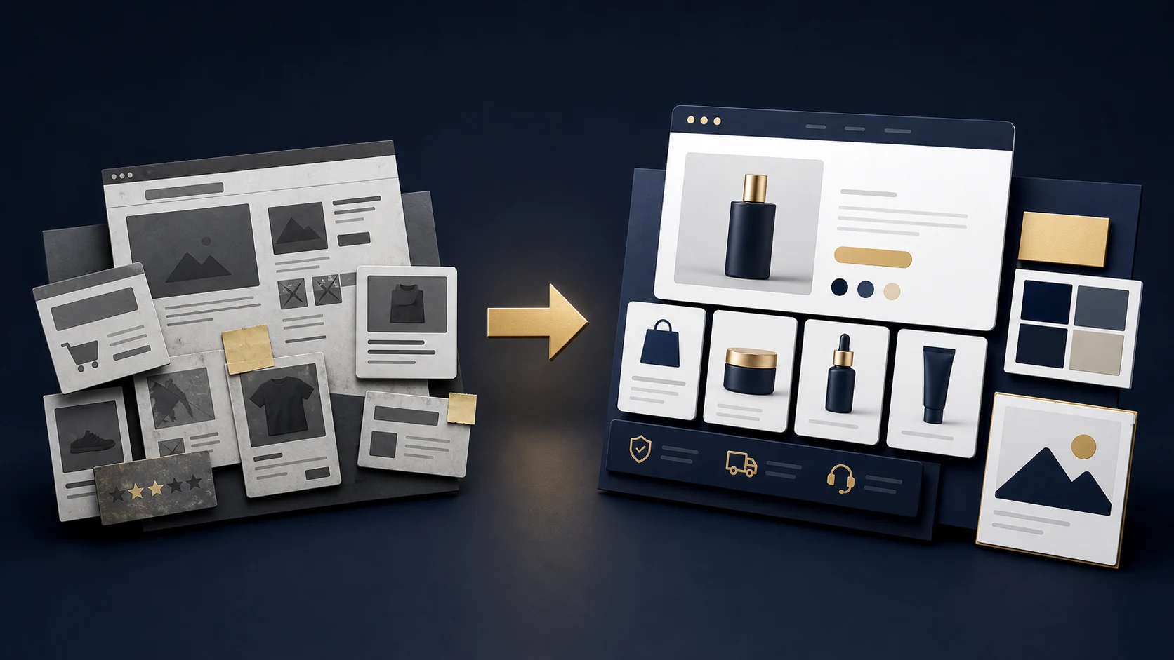
A Shopify store redesign should give the business a stronger foundation, not simply a new visual layer. The best redesign projects improve how customers understand the brand, browse products, trust the store and move towards checkout.
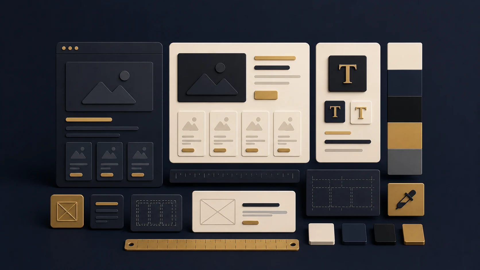
Shopify Store Redesign Checklist
A redesign is worth considering when your current Shopify store makes customers hesitate or makes your team slower to improve the experience. When the project is planned around customer clarity, mobile usability, trust and conversion, redesign becomes a commercial improvement rather than a surface-level refresh.
You can explore RexCode’s wider Shopify services or start with a free Shopify store audit if you want a clearer view of whether your store needs redesign, CRO, speed work or a smaller set of priority fixes.
Frequently Asked Questions
How do I know if my Shopify store needs a redesign?
A redesign is worth considering if the store has repeated UX, mobile, product page, trust or conversion problems across multiple pages, not just one isolated issue.
Is a redesign better than CRO?
Not always. CRO can improve a strong existing store, while redesign is more useful when the structure, layout and theme system are holding back broader improvements.
Will a Shopify redesign affect SEO?
It can if URLs, headings, metadata, internal links or content are changed without planning. SEO should be reviewed before and after the redesign.
Should product pages be redesigned first?
For many ecommerce stores, product pages are a priority because they directly affect trust, product understanding and add-to-cart decisions.