Table of Contents
01. Why Campaign Traffic Needs a Focused Page 02. Match the Page to the Campaign Promise 03. Keep the Offer Narrow 04. Structure the Page Around One Action 05. Place Proof Where Doubt Appears 06. Design for Mobile Campaign Traffic 07. Check Speed, Tracking and Handoff 08. Final Landing Page ChecklistA Shopify landing page is different from a normal product page or homepage. It has a narrower job: turn a specific traffic source into a specific action. When someone clicks from a paid ad, email campaign, influencer post or product launch message, the page should continue the same promise they clicked on and remove the distractions that do not support that goal.
Many ecommerce brands send campaign traffic to a homepage or collection page because those pages already exist. That can work for broad brand discovery, but it often weakens message match. A campaign landing page gives the brand more control over the offer, proof, product explanation, mobile journey and call to action.
Why Campaign Traffic Needs a Focused Page
Campaign traffic arrives with context. The visitor has already seen a message, image, offer or promise before reaching the store. If the landing page does not match that expectation, the visitor has to work harder to understand whether they are in the right place.
A focused Shopify landing page reduces that gap. It can explain one product, one bundle, one offer or one campaign angle without asking the visitor to navigate the full store. This is especially useful for paid traffic where every unclear click has a cost.
Match the Page to the Campaign Promise
Message match is one of the most important parts of Shopify landing page design. The headline, hero image, product framing and CTA should connect clearly to the ad or campaign that brought the visitor to the page.
If an ad promotes a skincare bundle for sensitive skin, the page should not open with a generic brand message. If an email promotes a limited launch, the page should not make customers search through the full catalogue. The first screen should confirm that the visitor found the right offer.
- Use the campaign promise in the hero message.
- Show the relevant product or offer immediately.
- Keep the CTA aligned with the action promised in the campaign.
- Avoid sending visitors into broad navigation too early.
- Make the page feel connected to the ad creative, email or launch message.
Message Match Checklist
Keep the Offer Narrow
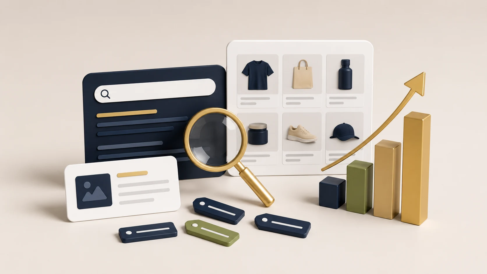
A landing page works best when it has a clear offer. That does not always mean one product, but it should mean one decision path. A page that tries to sell every category, tell the full brand story and promote multiple campaigns will usually feel more like a homepage than a landing page.
For Shopify brands, focused offers can include a product launch, seasonal bundle, best-seller set, quiz result, limited promotion, collection campaign or product education page. The key is to remove anything that does not help the visitor understand and act on that specific offer.
- Choose one primary offer for the page.
- Use supporting products only if they strengthen the main offer.
- Keep comparison sections simple.
- Do not overload the page with unrelated categories.
- Use one main CTA style throughout the page.
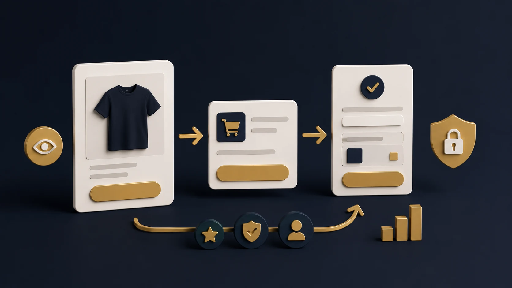
Structure the Page Around One Action
Strong ecommerce landing page structure guides the visitor through a clear sequence. The page should explain the promise, show the product or offer, answer key objections, build trust and repeat the action at the right moments.
This does not mean every landing page needs the same layout. A new product launch may need more education, while a discount campaign may need faster product access. The structure should match the visitor’s awareness level and the complexity of the buying decision.
Landing Page Structure Checklist
RexCode’s Shopify landing page design service is built around focused campaign pages that connect the offer, proof, mobile flow and primary action into one clearer buying path.
Place Proof Where Doubt Appears
Proof should not be treated as decoration at the bottom of the page. It should appear where customers are likely to hesitate. If shoppers may question product quality, use reviews or product detail. If they may question fit, use comparison, sizing, ingredients, materials or usage guidance. If they may question trust, show delivery, returns, guarantees or secure checkout reassurance.
Landing pages often perform better when proof is part of the buying argument rather than a separate section. The page should answer the doubts created by the offer, the price point and the product category.
- Use reviews near product decision points.
- Add delivery and return information before checkout intent.
- Use comparison blocks for products with multiple options.
- Include FAQs for practical buying questions.
- Keep trust messages specific rather than generic.
Design for Mobile Campaign Traffic
Many campaign visitors arrive from mobile devices. That means the mobile version of the landing page is not a secondary layout. It is often the main experience. The page should be easy to scan, quick to understand and simple to act on without pinching, searching or excessive scrolling.
Mobile landing page design should prioritise the order of information. The first screen should make the offer clear. Product details should be readable. CTAs should be easy to tap. Images should load quickly and support the decision rather than slow the page down.
Mobile Landing Page Checklist
Check Speed, Tracking and Handoff
A campaign landing page should also be practical to launch and measure. Before sending paid traffic to the page, check that the page loads quickly, tracking is working and the team understands how to update key sections.
Speed matters because campaign traffic is often impatient. Tracking matters because the team needs to know whether the page is helping the campaign. Editable sections matter because landing pages may need changes during a promotion, product launch or seasonal push.
- Check page speed before launch.
- Review image weight and third-party scripts.
- Confirm analytics and conversion tracking are active.
- Test form, cart and checkout behaviour.
- Document which sections the team can safely edit.
If the page is part of a wider conversion project, you may also want to review Shopify CRO support so campaign learning can feed into future product pages, homepages and store improvements.
Final Landing Page Checklist
A Shopify landing page should not feel like a disconnected page added to the store at the last moment. It should feel like a focused path from campaign promise to buying action.
Shopify Landing Page Design Checklist
The best Shopify landing pages are specific. They do not try to explain the whole brand at once. They help the visitor understand one offer, trust it and take the next step with less friction. That focus is what makes landing pages useful for paid ads, product launches and campaign traffic.
You can explore RexCode’s wider Shopify services or start with a free Shopify store audit if you want to understand whether your campaign traffic needs a dedicated landing page, CRO support or broader store improvements.
Frequently Asked Questions
What is a Shopify landing page?
A Shopify landing page is a focused page built around one campaign, offer or action. It is often used for paid ads, product launches, bundles, email campaigns or seasonal promotions.
Should paid ads go to a product page or landing page?
It depends on the campaign. Product pages can work for simple product intent, but landing pages are useful when the offer needs more explanation, proof, comparison or message match.
What should a Shopify landing page include?
It should include a clear hero message, focused offer, product or benefit details, trust signals, proof, FAQs, mobile-friendly CTAs and a tested path to cart or checkout.
Does landing page design affect conversions?
It can. A landing page that matches campaign intent, answers objections and makes the next step clear can reduce friction compared with sending every visitor to a generic page.